
Deity Name Art Blue Edition — The Hour Before the Snow Falls
Blue is the color of what has not yet happened. It is the sky before dawn breaks, the surface of a still lake waiting for the first wind, the breath held in a quiet room before a prayer begins. It does not arrive with heat like red or with stillness like white. It arrives with possibility. The Deity Name Art Blue Edition is built from this particular silence.
A frost-blue background shifts like winter light on fresh paper. Deep matte black letters do not float but sit, heavy and certain, on the cool surface. A rim of sapphire along the edges of each Devanagari curve catches a light that feels like morning on a mountain peak. Every Deity Name Art Blue Edition composition carries that crisp, contemplative stillness.
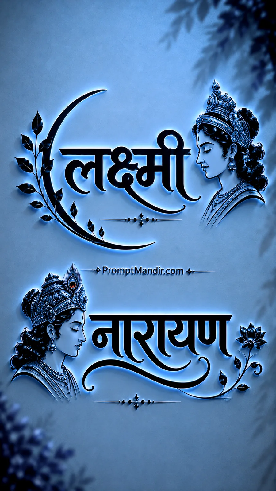
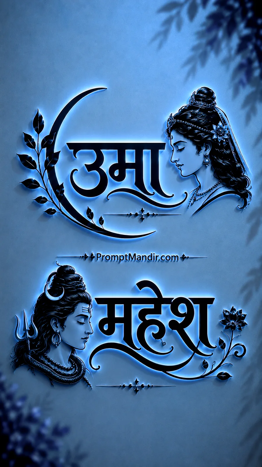
What sets the Deity Name Art Blue Edition apart is its patience. The purple edition whispered of dusk and velvet. This one speaks of early hours and stone floors cold under bare feet. The same paired names appear — Lakshmi and Ganesh, Lakshmi and Narayan, Ram and Sita, Shiv and Parvati, Krishna and Radha. They rise in the upper section and settle again below, separated by a clean, silent center.
The profile portraits face their names with the same calm recognition. The crescent ornaments curl softly. The leaf shadows fall in their corners as if thrown by a window you cannot see. Nothing demands your attention. Everything waits. Writing for the Deity Name Art Blue Edition is a study in cool restraint. The language must be crisp. The prompts must ask for clarity, not drama. The embossed finish must feel like a sacred seal pressed into winter parchment. Every instruction, every chosen word, is in service of that one blue hush.
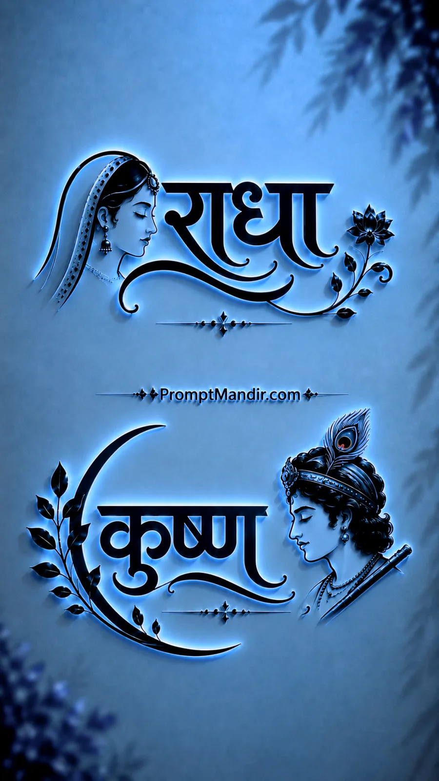
VIEW PROMPT
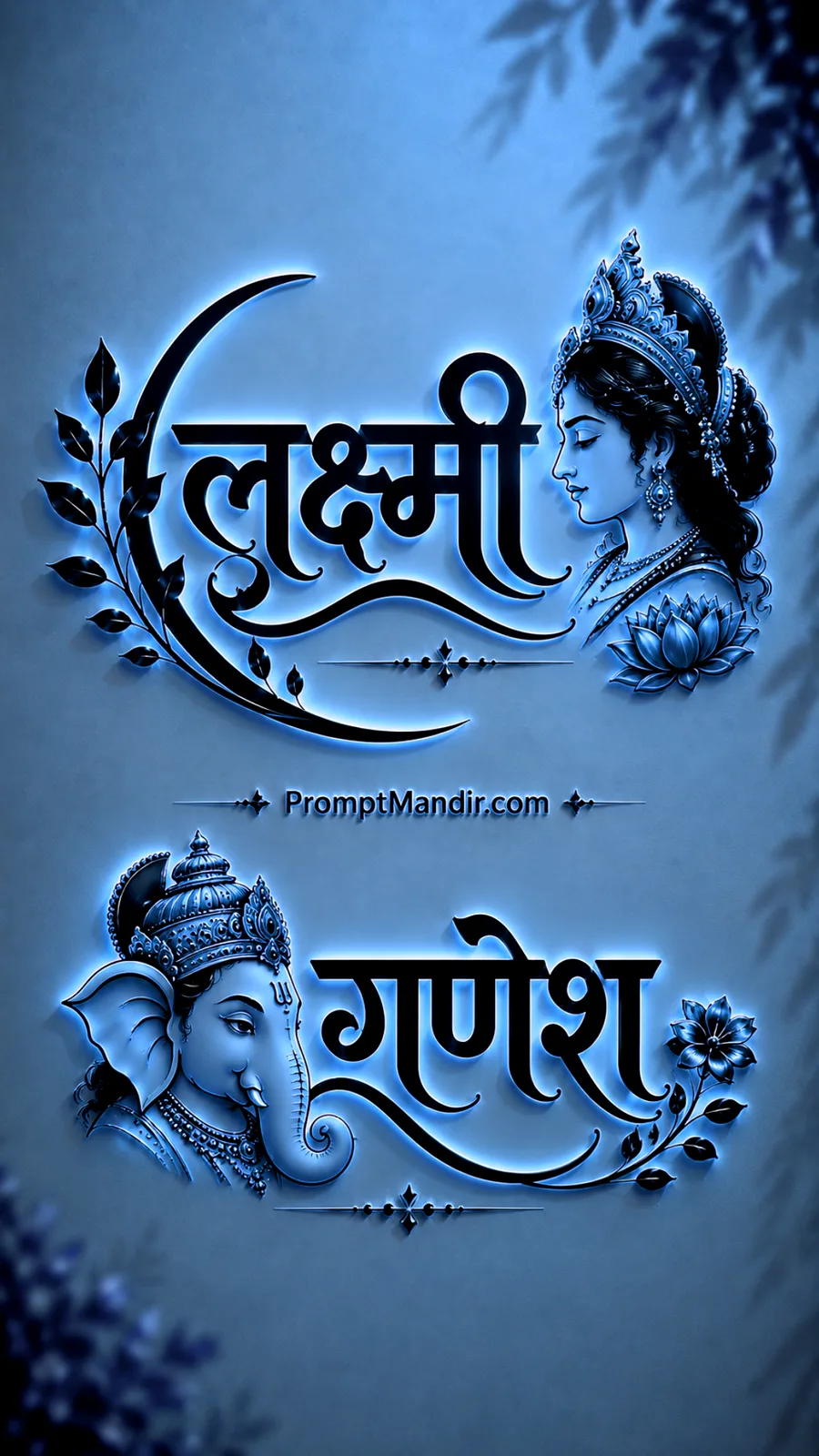
VIEW PROMPT
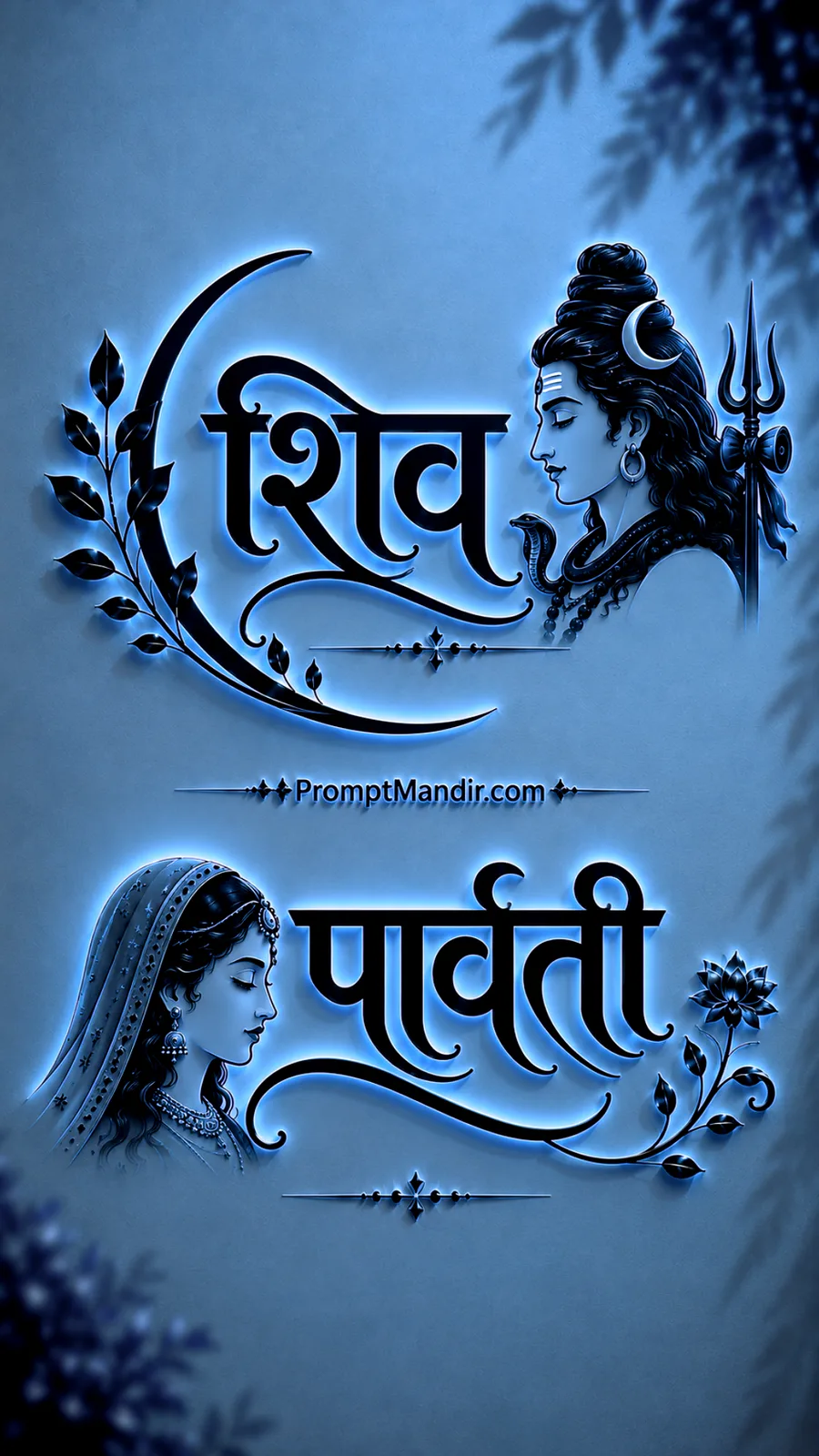
VIEW PROMPT
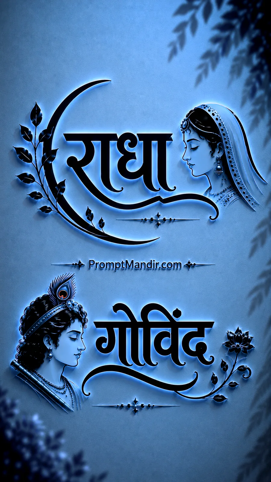
VIEW PROMPT
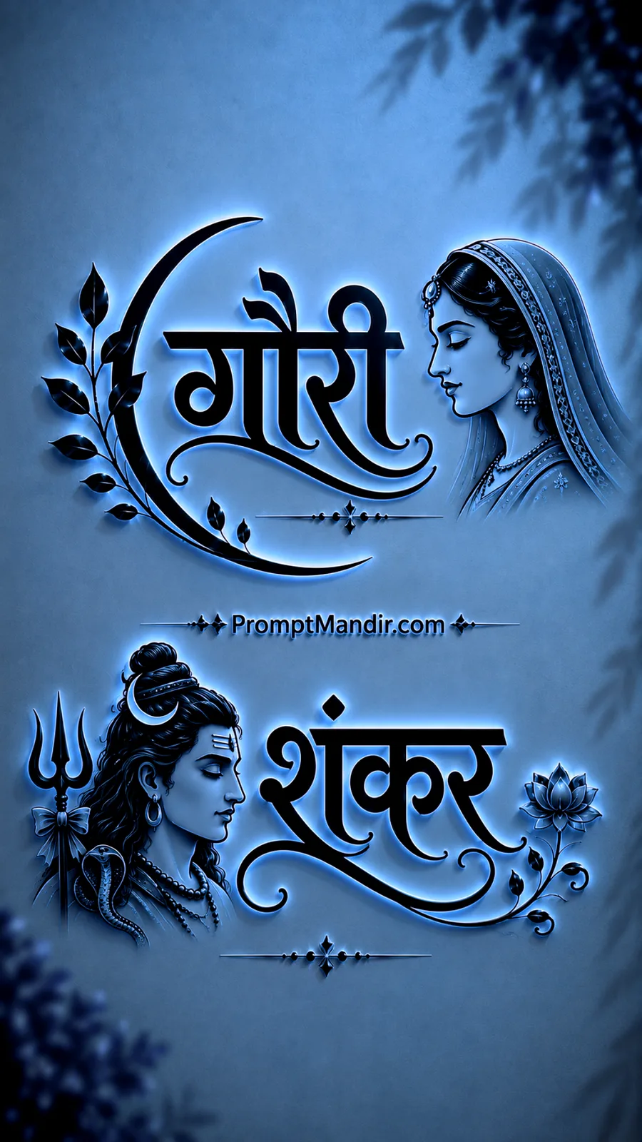
VIEW PROMPT
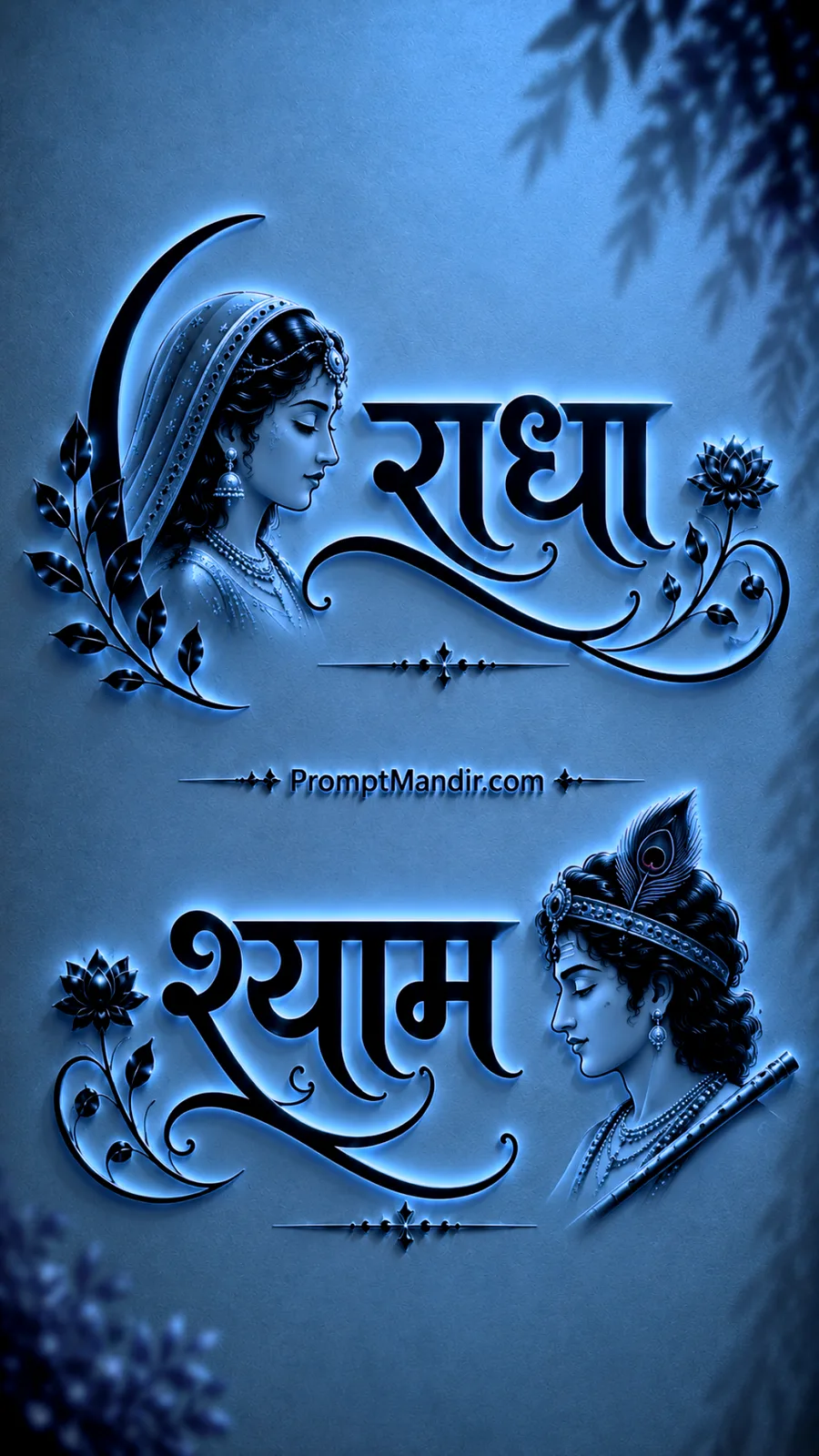
VIEW PROMPT
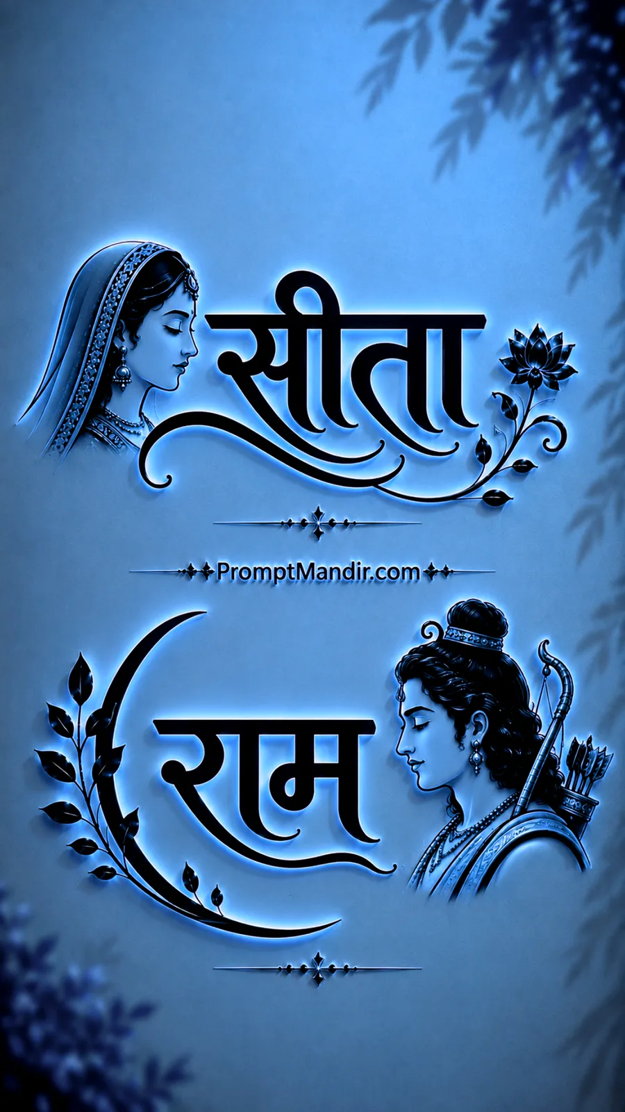
VIEW PROMPT
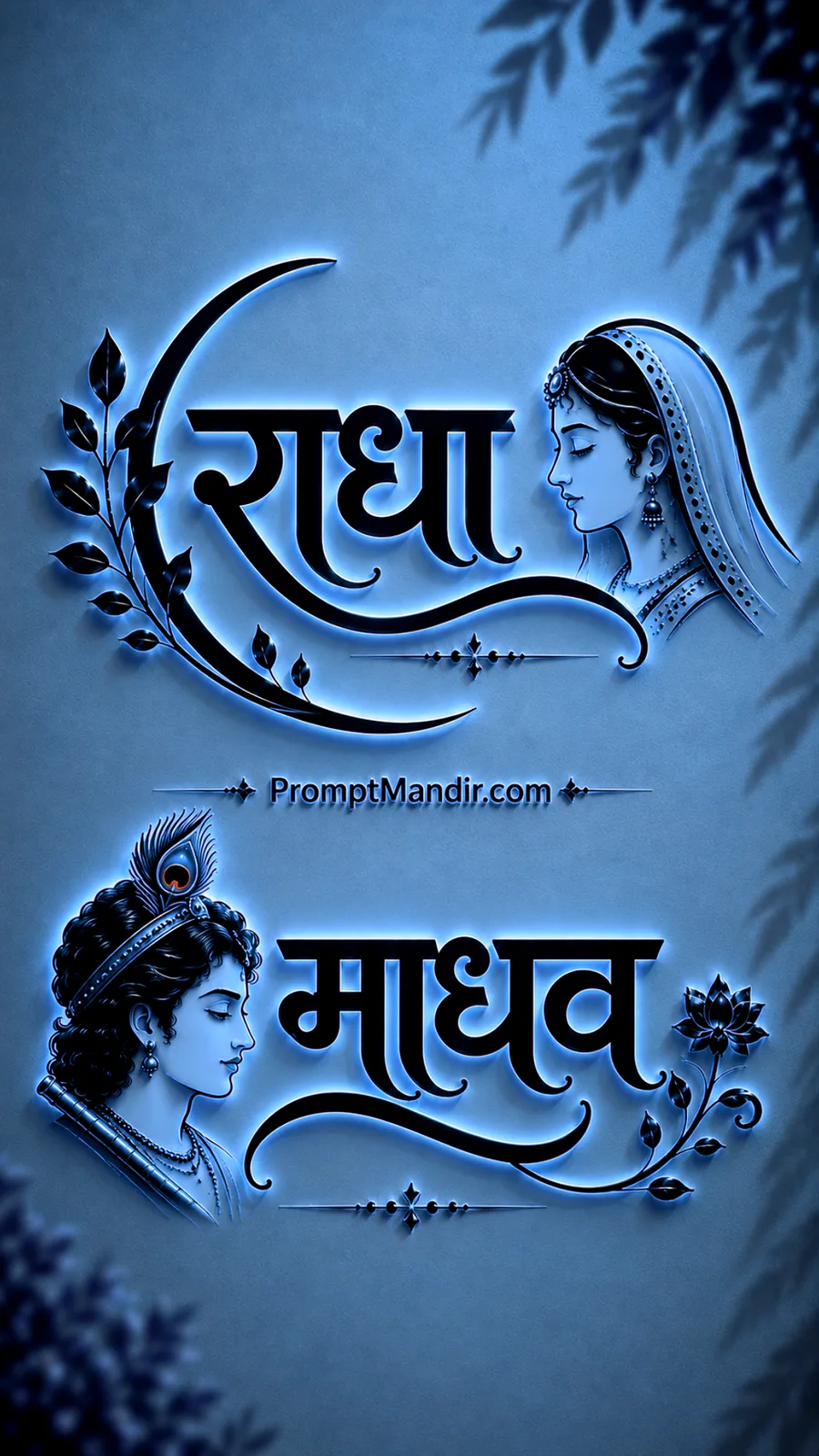
VIEW PROMPT
VIEW PROMPT
VIEW PROMPT
Explore More AI Prompt Collections
Discover more AI prompt collections covering devotional artwork, spiritual illustrations, divine characters, temple-inspired scenes, cultural designs, and creative visual concepts.
Browse related categories to find fresh inspiration for generating unique AI images, wallpapers, posters, social media graphics, and digital artwork.
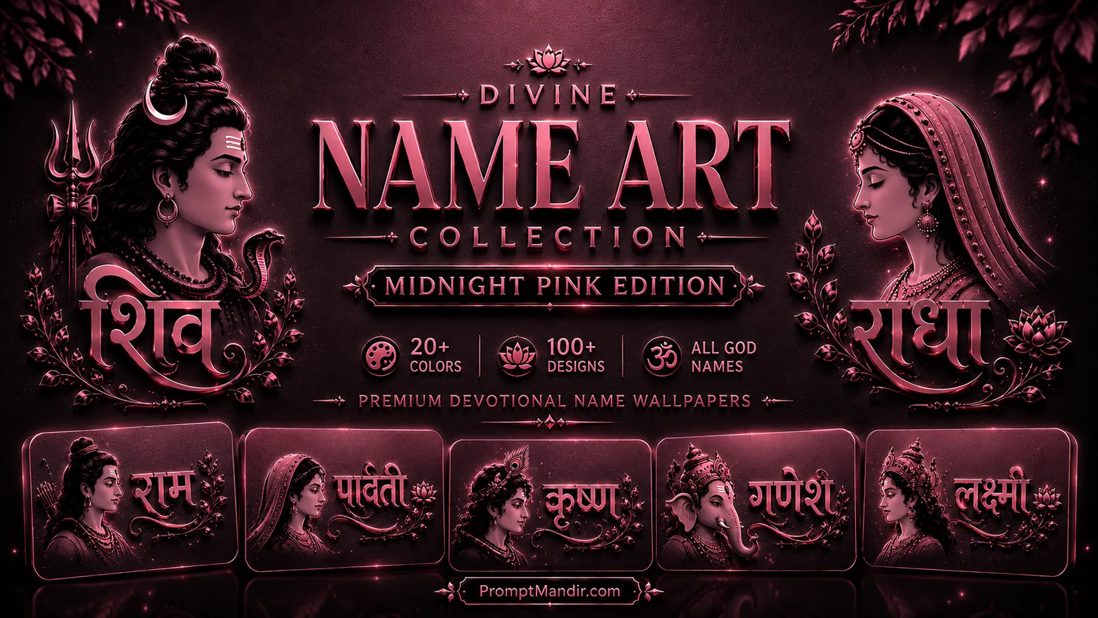
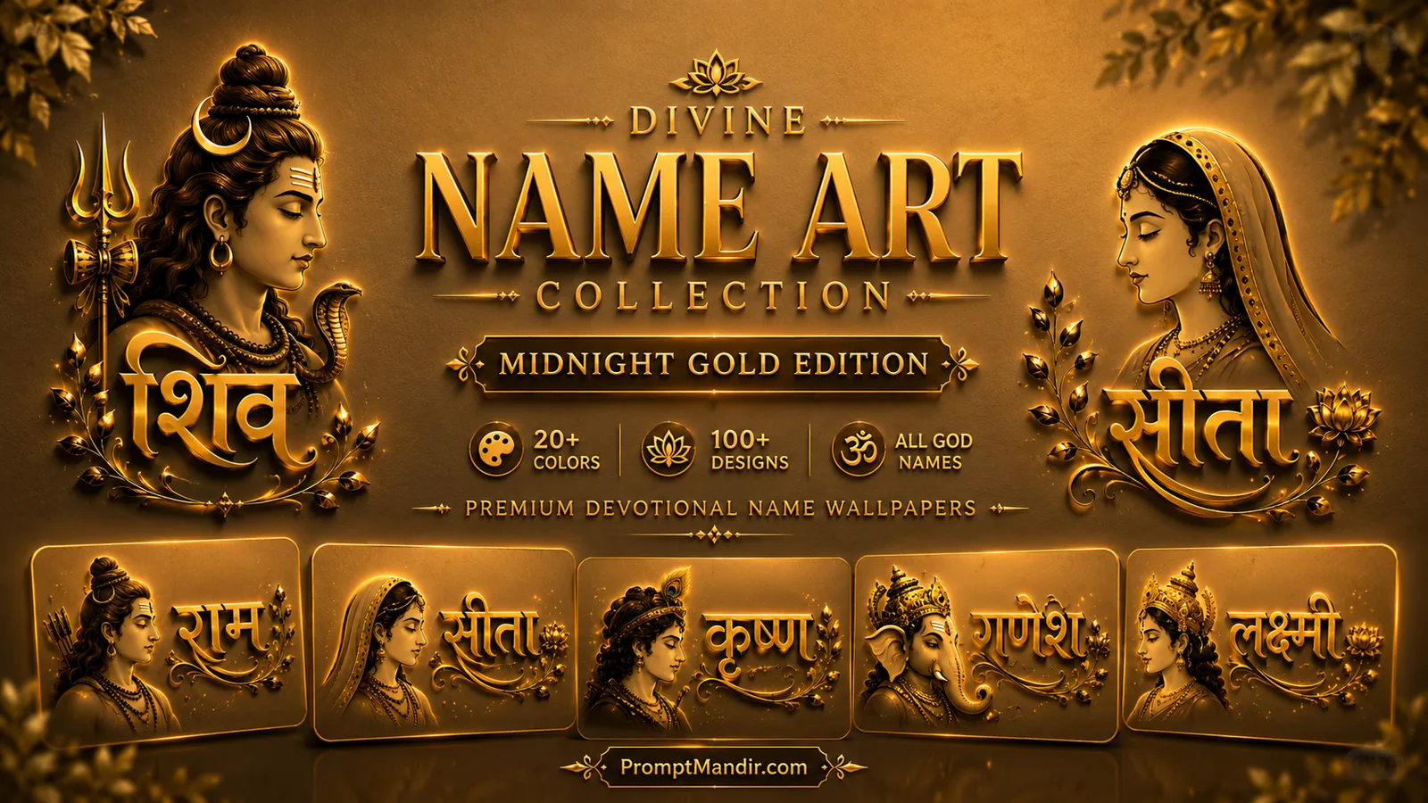
Prompt Customization Tips
The background of the Deity Name Art Blue Edition is frost, not fog. It is a smooth matte surface that transitions through delicate icy gradients. It should have the softness of handmade paper left in a cold room. Avoid glossy reflections. Ask for a refined premium paper-like finish. The blue must feel breathable, not heavy. This foundation is what gives the Deity Name Art Blue Edition its characteristic cool clarity.
The typography in the Deity Name Art Blue Edition carries the same embossed weight as the other editions, but its lighting is cooler. The letters are deep matte black. The beveled edges carry a soft sapphire metallic sheen. The rim illumination is an icy blue, like sunlight reflecting off a frozen window. The goal is not to dazzle. It is to define. Each letter in a Deity Name Art Blue Edition composition should feel like it was carved from cold stone.
The profile portraits in the Deity Name Art Blue Edition take on a winter clarity. Lakshmi’s jewelry is crisp and minimal. Shiva’s jata is cleanly outlined. Krishna’s flute rests against a silhouette that feels carved from cold stone. The line art must be sharp, with no blur, no feathering. The sapphire accents on the portraits should be sparing, just enough to catch the light. That precision is what makes the Deity Name Art Blue Edition portraits so striking.
The crescent ornament is still present in the Deity Name Art Blue Edition, but its leaves are leaner. Botanical shapes rendered in matte black with the barest touch of icy blue at the edges. They frame the upper typography without crowding it. Their job is to balance the portrait on the opposite side while maintaining the open, breathable quality of the composition.
The divine pairings in the Deity Name Art Blue Edition remain the structural anchor. The upper name faces right. The lower name faces left. Their gazes cross the silent center. This is not a collision. It is a recognition. The space between them is not empty. It is charged with an unspoken conversation that has been going on for centuries.
The divider and signature at the center of a Deity Name Art Blue Edition artwork must be treated with surgical precision. A thin ornamental line. A small, refined serif text centered perfectly. Nothing else. The tendency will be to fill the silence with decoration. Resist. The silence is the offering in the Deity Name Art Blue Edition.
The corner leaf shadows in the Deity Name Art Blue Edition are gentler here than in any other edition. Soft, blurred at the edges, as if cast by a pale winter sun through a frosted window. They remind the viewer that this artwork exists somewhere real. A room. A wall. A moment of quiet before the snow begins.
Frequently Asked Questions
What mood does the Deity Name Art Blue Edition aim to create?
A mood of cold clarity and quiet anticipation. It is not sad or distant. It is still. The frost-blue background and icy rim lighting evoke early morning, winter light, and the kind of silence that precedes something sacred. The Deity Name Art Blue Edition is designed for contemplation.
Why is the background described as frost-blue rather than sky-blue in the Deity Name Art Blue Edition?
Sky-blue is open and expansive. Frost-blue is intimate and textured, like paper that has been kept in a cold room. It has a tactile, handcrafted feel. It also pairs more naturally with the matte black typography, creating a grounded contrast that defines the Deity Name Art Blue Edition.
How does the embossed effect change in the Deity Name Art Blue Edition?
The embossing itself remains deep and sculptural, but the edge lighting shifts from warm gold to cool sapphire and icy blue. This changes the emotional temperature of the artwork. It feels more contemplative, less celebratory. That cool edge is the signature of the Deity Name Art Blue Edition.
What role do the profile portraits play in the Deity Name Art Blue Edition?
They serve as quiet companions to the typography. They do not demand eye contact. They face the sacred name, not the viewer. The clean line art style and the cool sapphire finish make them feel like carved ivory reliefs rather than painted portraits.
Why are the names paired in upper and lower sections in the Deity Name Art Blue Edition?
The pairing creates a visual and spiritual dialogue. The two names belong to a divine couple. Placing one above and one below, with their portraits facing inward, creates a sense of connection across the quiet center of the composition. This structure is fundamental to the Deity Name Art Blue Edition.
How should negative space be managed in the Deity Name Art Blue Edition?
Generously. The center must remain open and clean, holding only the small signature text. The space around the typography should be ample. This negative space is what gives the Deity Name Art Blue Edition artwork its breath and its premium, handcrafted feel.
Can I use a single name instead of a pair in the Deity Name Art Blue Edition?
Yes. A single name can occupy the upper section, with the lower section featuring a sacred phrase or remaining intentionally empty. The blue background and embossed styling will still carry the composition. The key is to maintain the same spacing and restraint that defines the Deity Name Art Blue Edition.
What must be avoided in the Deity Name Art Blue Edition?
Warm colors, gold accents, neon glows, busy backgrounds, photorealistic textures, and heavy decorative borders. The strength of the Deity Name Art Blue Edition is its cool minimalism. Any element that introduces heat or visual noise will break the spell.
Is the Deity Name Art Blue Edition artwork style effective for both screen display and physical printing?
Yes. The frost-blue matte background and crisp typography read beautifully on phone screens. In print, especially on matte paper, the embossed black letters and subtle blue highlights create a sophisticated, handcrafted object that feels like a limited-edition devotional print.
What is the purpose of the leaf shadows in the corners of the Deity Name Art Blue Edition?
They are the only suggestion of an external world. A soft natural shadow, as if a tree outside the frame is catching the morning light. It anchors the Deity Name Art Blue Edition composition in physical reality and adds a layer of warmth without introducing any actual warmth of color.
About This Deity Name Art Blue Edition
There is a shade of blue that appears only once a day. It arrives just before the sun breaks the horizon, when the world is still monochrome and the first light is not yet golden but silver. It lasts for minutes. Then it is gone.
The Deity Name Art Blue Edition is an attempt to hold that color in place. To let it rest behind sacred names like लक्ष्मी and नारायण, राम and सीता, शिव and पार्वती. To let it cool the edges of embossed black letters and trace the profiles of deities in thin, icy light.
This is not a collection for festival days. It is for the ordinary morning when you wake before anyone else. When the house is silent and the phone screen lights up with a name you have known your whole life, now rendered in frost and shadow, waiting for you to speak it back.